Cleveland is for Everyone — A Website Built for Access and Inclusion
The City of Cleveland serves over 370,000 residents and provides essential services such as public safety, parks, utilities, and economic development. It reflects the city’s cultural vibrancy and diversity, aiming to make Cleveland a great place for all citizens to live, work, and visit.
Visit the City of Cleveland Website:
Project Timeline
2020 – 2023
My Role
Senior UX Designer + User Researcher
Target Audience
CLE Residents, Businesses, Visitors + Employees
Industry
Government
Project Overview
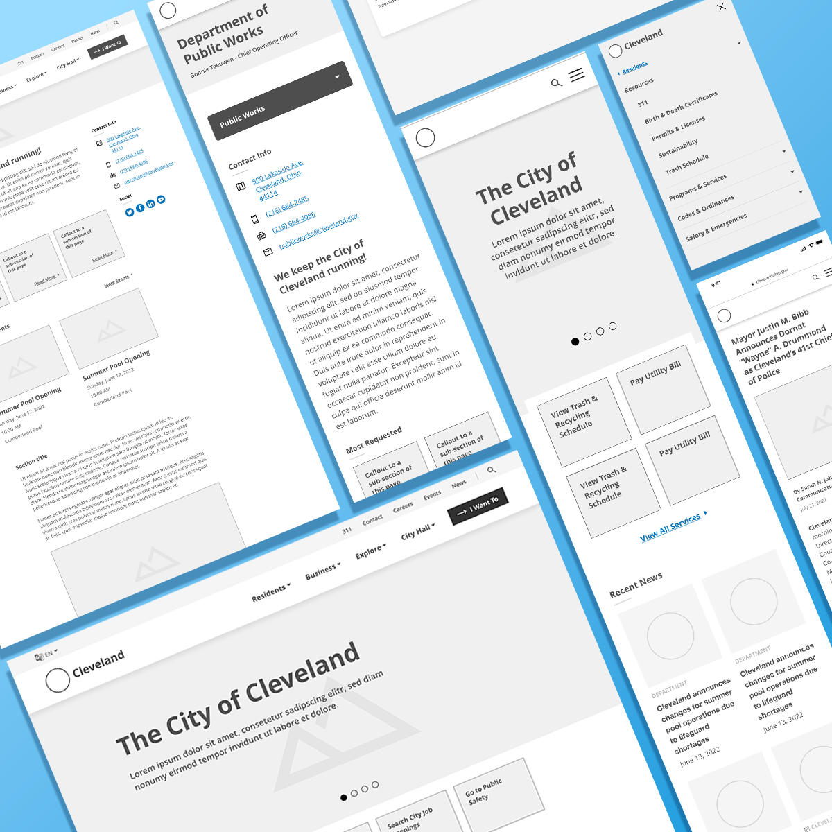
The City of Cleveland’s previous website was outdated and fragmented, making it difficult for residents to access crucial services. The redesign aimed to consolidate over 17 departments into a modern, easy-to-navigate platform, with a focus on accessibility, scalability, and user-centric design.

Solutions To Real-Word Problems
Every project presents its unique challenges. I’ll highlight the key challenges I faced during the City of Cleveland redesign and how I tackled each one with thoughtful, strategic solutions that helped us deliver an accessible and user-friendly website.
Challenge #1 — Fragmented Departments, Disjointed Systems
The Challenge
Imagine navigating a maze of over 15 departments, each with its own identity and some with their own website, content strategy, and set of priorities. The City of Cleveland’s online presence was fragmented and inefficient, with most departments having their own digital spaces over the past two decades. The task was clear — unify these silos and create a cohesive website for the entire city.
The Solution
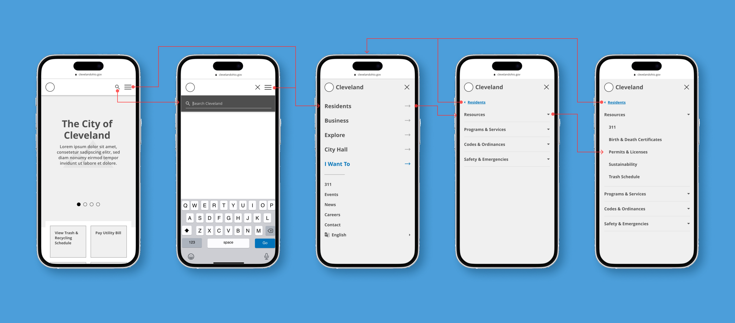
Strategic Information Architecture – Developed a clear and intuitive site structure to unify all departments while maintaining their unique identities.
Flexible Content Strategy – Designed a system of 50+ adaptable, reusable content blocks and component styles within Drupal, allowing departments to efficiently manage and update their content.
Scalable Design System – Ensured visual and functional consistency across departments, creating a more user-friendly experience for residents and city employees.
Streamlined Content Management – Simplified workflows, reducing redundancies and making it easier to keep information accurate and up to date.
Future-Proofed Digital Presence – Established a scalable and sustainable web ecosystem that adapts to the city’s evolving needs while enhancing accessibility and efficiency.
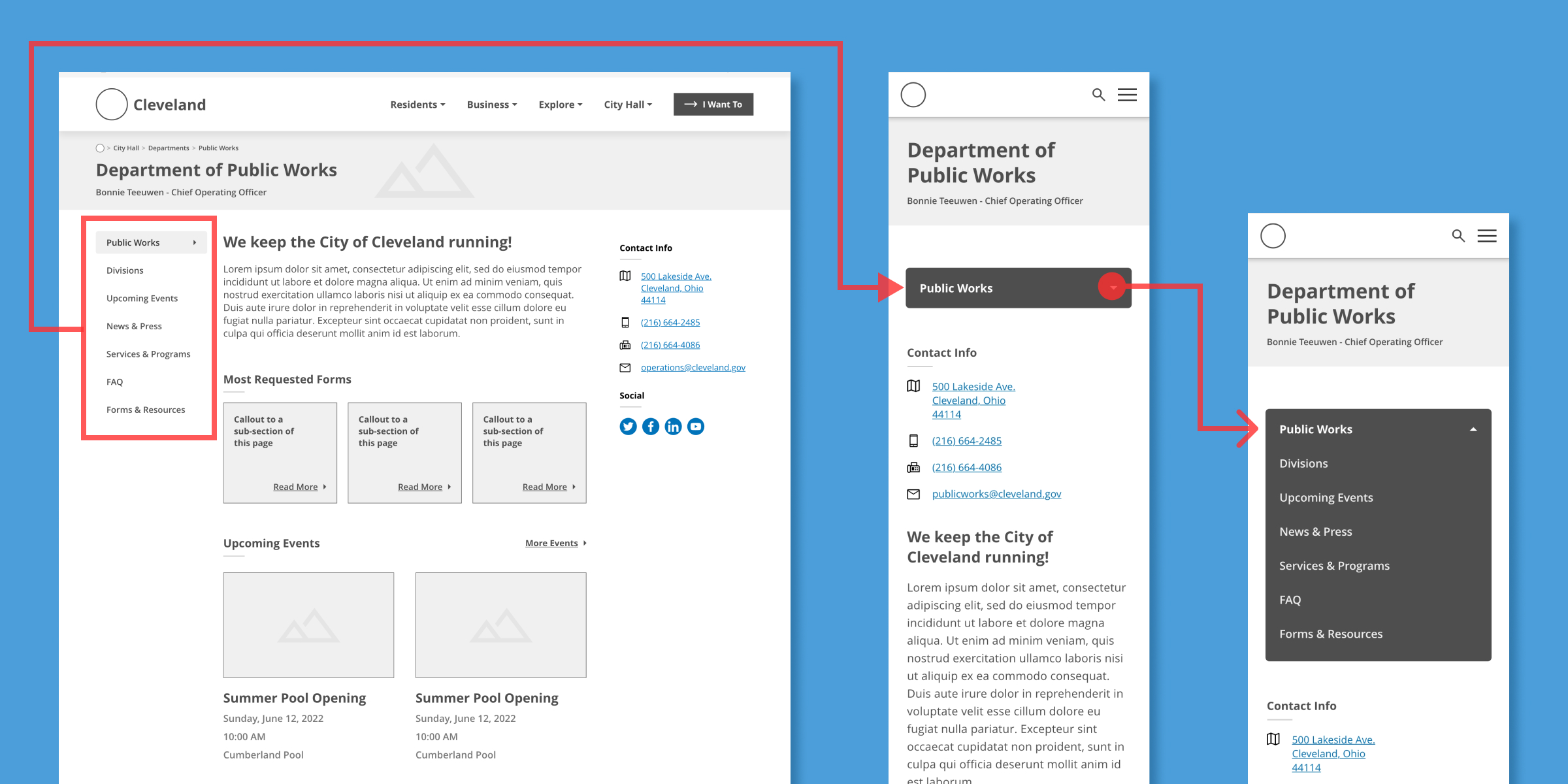
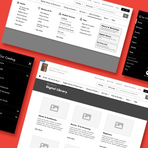
On mobile, the secondary navigation shifts into a sticky dropdown, ensuring easy access without overwhelming the interface. This approach balances usability with the complexity of Cleveland’s diverse departments.
Challenge #2 — Leadership Transitions and Shifting Priorities
The Challenge
Just as we began the project, Cleveland underwent a major leadership change with the election of a new mayor. This transition brought shifting priorities, departmental restructuring, and a need to realign project goals. This meant navigating uncertain waters and constantly adapting our design to meet the evolving vision of city leaders.
The Solution
Proactive Collaboration – Engaged directly with new leadership through stakeholder interviews and department meetings to understand their vision and priorities.
Resident-Centered Approach – Conducted surveys to ensure the website remained aligned with community needs while integrating new administrative objectives.
Adaptive Strategy – Quickly refined the design and content strategy to reflect the evolving direction of city leadership, keeping the project on track and relevant.
Future-Focused Alignment – Positioned the website as a flexible and scalable tool that supports both immediate and long-term goals for the City of Cleveland.
Challenge #3 — Overcoming Resident Frustration with an Outdated System
The Challenge
The old City of Cleveland website had frustrated residents for years. It was hard to navigate, lacked up-to-date content, and failed to meet accessibility standards. Residents needed a new platform that was intuitive, efficient, and easy to navigate—one that reflected the vibrancy of the city and gave them seamless access to vital services.
The Solution
Comprehensive User Research – Conducted year-long surveys with residents, businesses, and community organizations, along with stakeholder interviews, to ensure the website met the needs of all users.
Intuitive Navigation & Content Strategy – Refined the global menu and restructured content based on user input, making essential information easy to find.
WCAG Compliance & Inclusive Design – Designed the site to meet WCAG Level AA standards, ensuring it met legal accessibility requirements while providing a better experience for all users.
Seamless User Experience – Created a visually engaging, efficient, and accessible platform that serves both residents and businesses effortlessly.
Challenge #4 — Information Overload and Content Clutter
The Challenge
The existing website was a labyrinth of outdated, duplicated, and irrelevant content, making it nearly impossible for users to find what they needed. With so much information to sift through, organizing and presenting the content in a clear, intuitive way became a major hurdle.
The Solution
Strategic Content Framework – Developed a scalable content strategy to bring clarity and consistency across departments, offices, commissions, and affiliates.
Data-Driven Decision Making – Conducted in-depth stakeholder interviews and a comprehensive content audit to identify redundancies and prioritize essential information.
Empowered Content Management – Created a structured content approach that enabled administrators and future content creators to maintain clear, well-organized pages.
Enhanced User Experience – Streamlined content to eliminate clutter, highlight key information, and improve navigation, making it easier for residents and businesses to find what they need.
Sustainable & Scalable Approach – Established a long-term content strategy that simplifies updates and ensures the site remains organized and user-friendly over time.
Challenge #5 — Scalability and Accessibility
The Challenge
With the city’s growth and evolving needs, the website needed to be scalable, flexible, and able to accommodate future growth. Additionally, accessibility was paramount, ensuring that every Cleveland resident—regardless of ability—could use the site effectively.
The Solution
Flexible, Future-Ready Design – Built a modular system in Drupal that allows the site to scale seamlessly as the city’s needs evolve.
Empowered Content Management – Enabled departments to independently manage and update content while maintaining a consistent structure and user-friendly experience.
Unified Digital Experience – Integrated external Cleveland websites, such as Economic Development, back under the city’s main umbrella to create a more cohesive experience for residents and businesses.
Accessibility at Every Stage – Collaborated closely with the design team to ensure the site met or exceeded WCAG Level AA standards, providing an inclusive experience for all users.
Strengthening Community Trust – Designed a platform that promotes transparency, unity, and confidence in the city’s digital presence.
Tools + Technologies Used
Adobe XD
Wireframes + Prototypes
Figma
UI Design, Stakeholder Presentations + User Flows
SurveyMonkey
User Research
Google Docs
User Research
Google Sheets
User Research + Information Architecture

Maze
Usability Testing
Slack
Communication
Jira
Quality Assurance
Drupal
Content Management System (CMS)
Final Thoughts
Redesigning the City of Cleveland’s website was more than just a visual update—it was a strategic transformation. The new platform enhances accessibility, simplifies content management, and delivers an intuitive experience for both residents, businesses, and city staff. Through collaboration, research, and adaptability, we built a website that not only serves the city’s needs today but is also designed to grow with it into the future.
 David's Portfolio